Affichage des articles dont le libellé est tutorial. Afficher tous les articles

Colouring with Coloured Pencils


Colouring with Coloured Pencils


It's quite easy to create tone and form with coloured pencils just by changing the pressure that you apply from the pencil onto the paper. Below are a few ways I like to use the medium. To create a nice gradation from one colour to the next, you can either use a flicking motion or use fading. Both require you to apply tons of pressure on one area (dark area) and gradually reduce it, letting the pencil just hover over the paper and finally apply no pressure at all on the opposite area (light area). Cross-hatching is what I like to use when I try to achieve a flat layer of colour. This can also be used when shading since the tighter the cross-hatching is, the darker the layer becomes.

Below are only for ways to blend colours together. NOTE that there are more ways than this. Dividing the area into sections which corresponds to only one colour saves a lot of time when shading. It does however have the tendency to achieve a result where the colours aren't blended well together. Layering creates an entirely different shade of colour. It is however the most time consuming since it's not just putting the two colours/shades together, it's marrying them into one. This is done by starting with a slight pressure from the pencil and then building it up from there: gradually adding more pressure as you move onto a darker shade. Obviously, you don't have to start from the lightest colour. Dark, which is what I call this technique, is using the darker/darkest shade first to map out the dark areas and the shadows, then simply just adding the main colours to blend it together. 
For all of these boxes, I used red as my main colour and chose another colour that I wanted to shade with it. The first combination uses another colour from the same colour family of red. I used a darker shade of red. The second combination uses a colour that's somewhat related to red, preferably the colour next to it on the colour wheel, which is wither orange or violet. The third combination uses black with red to really emphasis the contrast between the bright red and the deep black. The last combination uses a complementary colour of red which is green to provide depth and interest to the colour.

Colouring with Copics


Colouring with Copic Markers

Copic markers are one of the most well known and recommended brand for graphic markers by artists. However, it does cost a fair bit of money, as well as the other brands of graphic alcohol-based markers. If you're not of the rich side, it's most likely that you buy one marker after the other, and that's a hard thing to do - choosing which colours to buy first.
How I would've approached this situation is that I'd buy two shades of each colour (red, yellow, blue, skin, grey ect). I'd emphasise getting a dark grey colour such as C-7 since it's useful when it comes to shading. Then I'd buy a black and a colorless blender marker. Overall I'd most likely have 20 Copic Markers. From there, you can build up with by buying more shades of the colours you mostly use.
The image below is a comparison of how I coloured with only 5 Copic Markers and the other one with 9. The image on the left is where I used the grey colour to shade and I only had two shades of brown for the skin colour. The image on the right, I have 5 shades of skin colour and didn't use a grey since I had a dark brown to sue for the shadows.


Hair

Drawing Hair

There are a few guides to consider when drawing the hair. First off, know the direction of the hair. It naturally falls downwards, however, it's possible to create artistic hairstyles which a lot of fashion designers definitely incorporate to their runway collections. Always take note of gravity and other forces that act on the hair. For example, it might be pinned to one side, or you might choose a simple ponytail hairstyle.
The three main guides are:
Point, which is also called the growth point. It makes it easier to draw strands of hair that start from that point. This is useful for drawing the fringe or when hair is secured by a hair tie.
Parting is self explanatory. Different from what I said before, hair doesn't actually grow on one area or point on the head.
Hairline, which is the transition of the hair to the skin. This area of the head should not be a harsh line but a smooth blend, so it's best to use flicking motions.

Facial Proportions

Facial Proportions for Fashion Illustration

Fashion illustration captures the ideal facial proportions of women as well as men. Some may argue that there's absolutely no need for the face because the main focus is the garment design. To an extent I agree that you want the focus to be on the clothing itself, however if I was to emphasise the face, I would've drawn a portrait instead of a full body. Fashion illustration, in my opinion, depicts the entire body: the movement, expression, attitude and clothing. 
So if you want, take the time to know the ideal facial structure. The eyes are located halfway from the top of the head to the chin. A quarter down from the eyeline is where the nose is usually placed. An eighth down from the noseline is where the mouth is. Note that the distance between each eye is the length of an eye.
Ideal beauty is all about the right facial proportions.

Creases and Folds on Clothing

Creases and Folds on Clothing

Creating a representation of garments can be quite difficult as it is easily overdone and sometimes underdone. To get you started with drawing creases on clothes, the basic lines are:
Curves, which are used almost everywhere. A simple flick of the pen provides a natural look to the illustration.
Straight, which represents the effect of gravity and other forces (extension) on the garment.
V or Hooks, which are commonly used for the joint areas in the body, such as the elbows, knees, under the arms, waist and even under the bust area.
TIP: Observational drawing is always a great learning tool. Practice drawing from real life. And don't be scared to combine these basic lines together. Experiment a little or maybe a lot. This allows 

Dressing the Fashion Figure

Drawing Clothes for Fashion Illustration

To learn how to draw clothes on the model is a major part of fashion illustration. I've tried my best to create a method that will explain how I go about dressing the fashion figure.
Both drawings are of the same pose to make it easier to understand. 
The pink lines are called action lines which I use to help me determine the hem of the skirt. Since it is a figure in motion, the garments will move with the body. So when drawing the top, the hem line should follow the shoulder or apex action line. When drawing the skirt, the hem line should follow the waist or hip action line. 
The pink broken line is called the centre front which helps me when drawing the details of the dress. This shifts when the torso moves to an angle which helps with how I apply perspective to my drawing.
The blue diagonal line which I've turned into triangles are what I've create to explain how I apply the effect of gravity to the clothing. When the line is leaning to the left, this means that the left part of the garment (for example the sleeve) will be further from the body. This is shown in the second figure, where the body has been coloured in flesh and you can see how the fabric hangs on the body due to the white gaps between the line of the clothing and the edge of the body. To make it easier how to determine which is the left or right part of the fabric, since in some cases it can be difficult, I make the diagonal line a triangle, but always going down from the highest point. Gravity pulls down. 

Fashion Illustration: Inspiration and Technique by Anna Kiper gives tips on how to dress the fashion figure.

Figure in Motion

Drawing Figure Poses

Drawing the fashion figure is one thing; making different poses is another.
When it comes to drawing the figure in motion, there are a few guidelines that are very helpful to create a balanced and realistic pose.
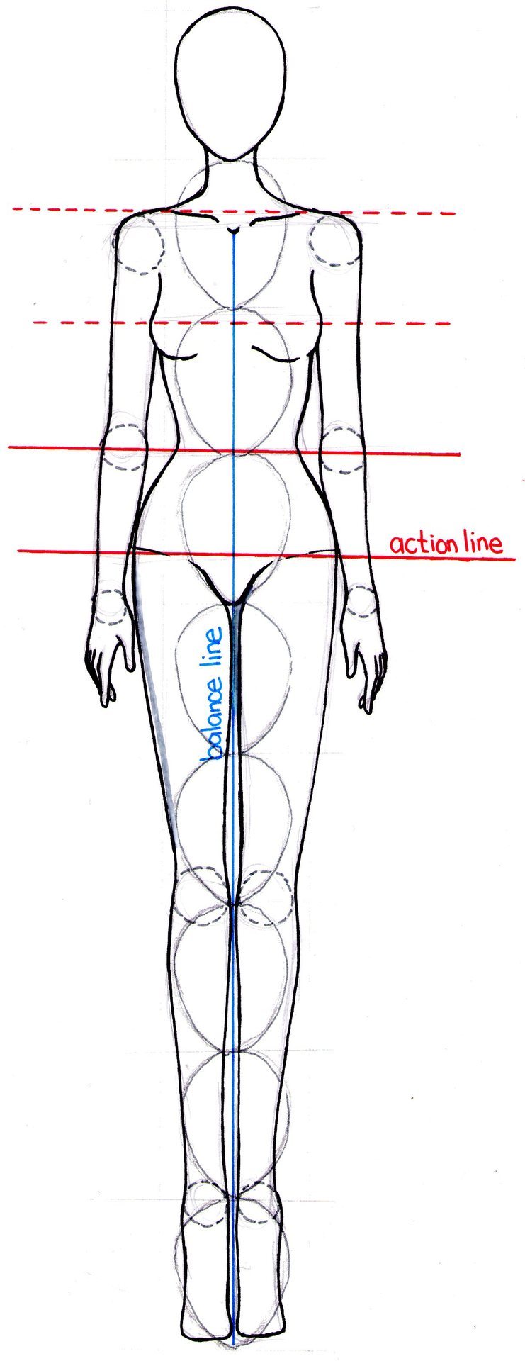
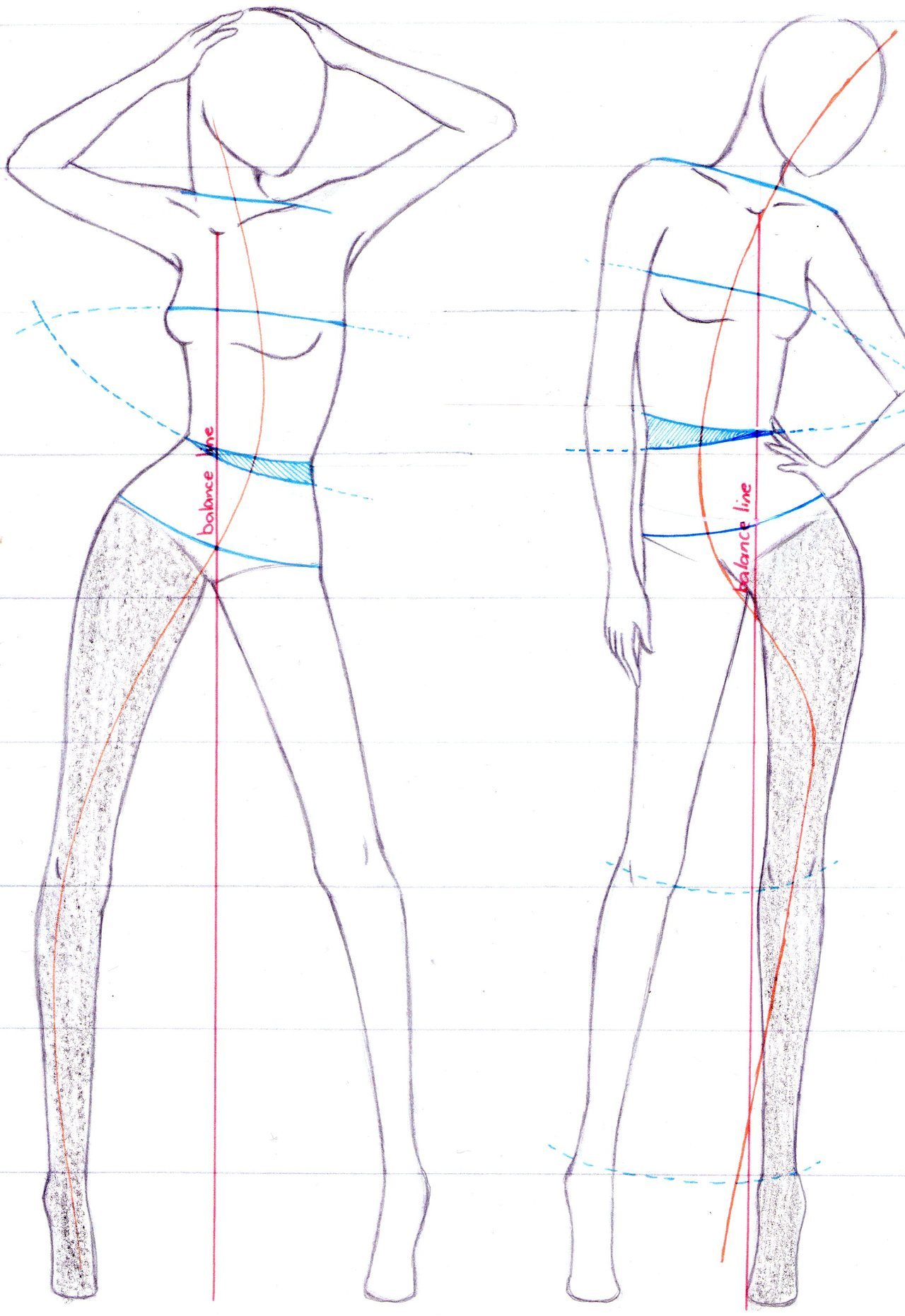
These lines are called action lines (red) which I have divided into two groups. (1) The broken lines are the shoulder action line and the apex action line. (2) The solid lines are the waist action line and the hip action line. When the figure moves, the very common S-curve is formed. If you study photos of models, a normal pose is a contrapposto which is another name for the S-curve. This represents the relaxed positing of a figure.
To achieve an S-curve (orange in the second photo) , the two sets of action lines must intersect at one point, thus creating a curve in the torso where one side is stretched while the other is compressed. This is shown in the second photo with the action lines in blue.
Another guideline is the balance line (blue) which divides the body in half - when in front view - always starting in between the collar bones.
Another guide is the shaded leg which is shown in the second photo. This leg is where most of the body weight is on which means this must always be closer to the balance line. The bottom curve of the letter S should also fall on the shaded leg which is also on the same side as the intersection point of the action lines. While this is called the support leg, the non-shaded leg is called the play leg. There is much more freedom in drawing the play leg since it has not particular use when drawing a balanced figure.
I tend to draw my figures as a representation of the human body, only elongated, therefore I learned how to properly draw the body that looks realistic, balanced and possible.

Drawing the Figure for Fashion Illustration

The 9 Head Technique

After sourcing inspiration, it's time to get started with drawing the fashion illustration. This is not directly the step after gathering inspiration, there should be at least a few preliminary sketches. Once the final design (sketch) has been decided, then that's the time to start drawing the figure.
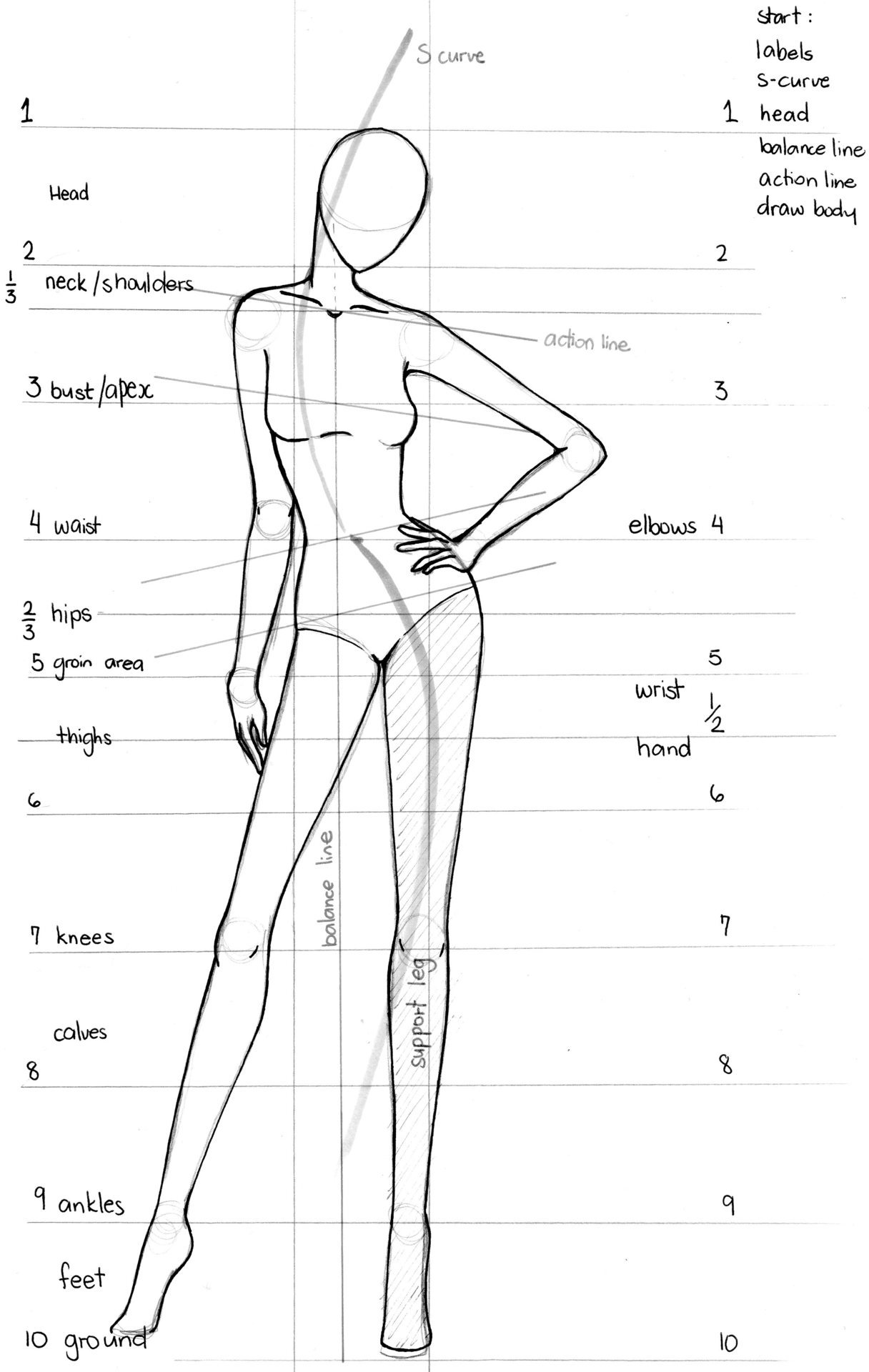
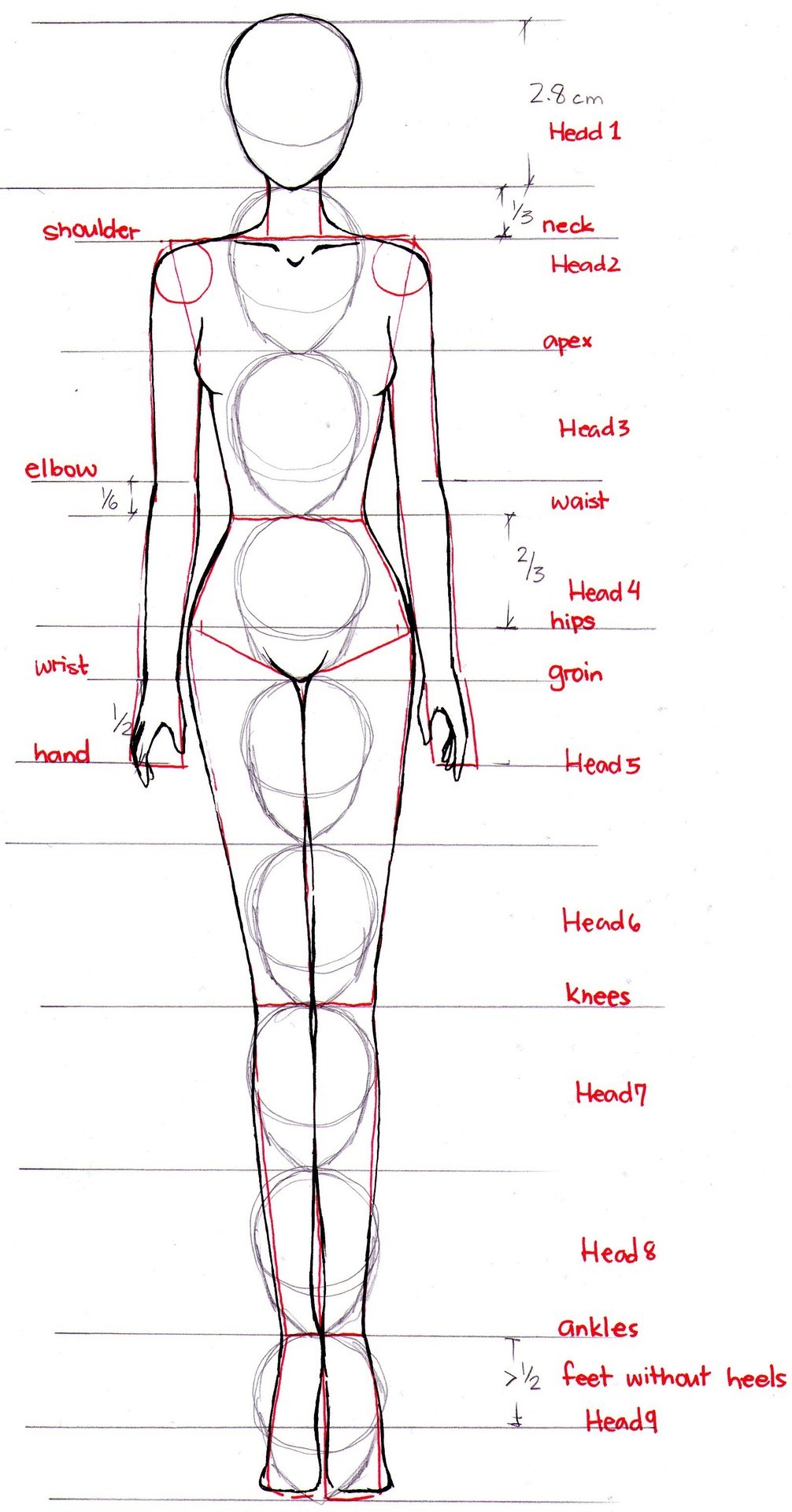
I didn't come up with this technique, however this is somewhat my version or my understanding of the nine-head technique and how I apply it to my usual fashion illustrations. There are so many versions of this technique that it gets a little complicated, specially when knowing which one is the right one. But I've come to a conclusion that the technique is just a general guide in drawing a croquis. Everyone is different from the person next to them with very similar proportions but at the same time slightly different. I found this to be the simplest to follow considering that I kind of modified it to my preference.
The image on the left, is quite self explanatory with the nine identical heads vertically down and lines between each head indicating what body part it represents.
This image is from my Tumblr page.