Affichage des articles dont le libellé est drawing. Afficher tous les articles

Colouring with Coloured Pencils


Colouring with Coloured Pencils


It's quite easy to create tone and form with coloured pencils just by changing the pressure that you apply from the pencil onto the paper. Below are a few ways I like to use the medium. To create a nice gradation from one colour to the next, you can either use a flicking motion or use fading. Both require you to apply tons of pressure on one area (dark area) and gradually reduce it, letting the pencil just hover over the paper and finally apply no pressure at all on the opposite area (light area). Cross-hatching is what I like to use when I try to achieve a flat layer of colour. This can also be used when shading since the tighter the cross-hatching is, the darker the layer becomes.

Below are only for ways to blend colours together. NOTE that there are more ways than this. Dividing the area into sections which corresponds to only one colour saves a lot of time when shading. It does however have the tendency to achieve a result where the colours aren't blended well together. Layering creates an entirely different shade of colour. It is however the most time consuming since it's not just putting the two colours/shades together, it's marrying them into one. This is done by starting with a slight pressure from the pencil and then building it up from there: gradually adding more pressure as you move onto a darker shade. Obviously, you don't have to start from the lightest colour. Dark, which is what I call this technique, is using the darker/darkest shade first to map out the dark areas and the shadows, then simply just adding the main colours to blend it together. 
For all of these boxes, I used red as my main colour and chose another colour that I wanted to shade with it. The first combination uses another colour from the same colour family of red. I used a darker shade of red. The second combination uses a colour that's somewhat related to red, preferably the colour next to it on the colour wheel, which is wither orange or violet. The third combination uses black with red to really emphasis the contrast between the bright red and the deep black. The last combination uses a complementary colour of red which is green to provide depth and interest to the colour.

The Sketchbook

The Sketchbook

For an update of my life: I have just recently finished all of my exams for high school and I am officially done with my 13 years of schooling. The feeling is great, but there's a sense of emptiness. Perhaps, it's the fact that there's nothing else that I can really do. My mornings used to be so occupied with having to force myself to wake up early to go to school. Now it's waking up in the afternoon and reducing my productivity.
I decided I'd steer clear from that sort of black hole that could be the end of me. I haven't been constant with updating this blog or my other blog due to the busy month I had because of exams. So, I want to slide back into my routine or schedule to post every Friday. That allows me to get out of bed early at least once a week to create fashion sketches or illustrations to post here.

The Wishlist

With the pressure of exams creeping in, it's quite funny that I find random internet surfing more interest than ever. Recently I've stumbled upon drawing workspace videos. After viewing a couple of drawing workspaces on YouTube and just about anywhere, I've found myself drooling over art materials. It's quite impossible for me to purchase all of these magnificent inventions right now. I don't think it'll happen anytime soon, either. [Insert deep sigh here].
I do admit that this wishlist has a recurring theme in it. I mostly want graphic markers and coloured pencils. I have a sufficient amount of these types of supplies already sitting in my drawing workspace, but somehow I want more. It is quite unnecessary for me to buy these in the future and I probably should purchase other materials that I haven't experimented yet such as oil paints. I guess I mostly gravitate towards drawing materials rather than painting supplies and considering that my illustrations are more recognised now compared to 5 years ago, I want to experiment which brand will suit my style best. With that said, yes, I am starting to save now to purchase these dream art materials! [Insert another deep sigh here].
It'll take time. Lots of it.

The Sketchbook

The Sketchbook

I thought I'd share some quick sketches of designs that I've just recently created. I figured since I wouldn't be able to turn every design I come up with into a fashion illustration, I might as well keep them nice and simple in a sketchbook.
I'm a bit worried though that people will steal these designs. That's probably the only downside of the internet. Nothing's completely safe. 
However, I still wanted to share this with you guys because it's an informal illustration - just raw ideas coming out of my head. There are no facial features or intricate details. There's just the pencil on paper that accurately captures the movement of my hands and my thinking process. These are simple shapes that create the starting point of a fashion design.

Philippine Culture

Philippine Culture


Media: Faber-Castell pencils, Pilot G-TEC 0.3mm black fineliner and Quill white A4 Multiboard
Time: 1 hour and 30 minutes

For my Visual Communication and Design class, we were told to create two folios and it was completely up to us what we wanted to design in each folio. I chose fashion design for folio 1 and architecture in folio 2. It was a fun project, but I wish I had more time to make my folio better. It's sad to say that the fun only really lasted a while. Once the teacher confirmed the date of our submission, it was a tragic journey from there on.
This is one of the three designs I created. It was inspired by the Philippine culture with the Santo Niño festivals and celebrations. I was influenced by the costumes that the dancers wore which reflected the religious beliefs of most Filipinos. I've been in love with the combination of red and yellow/gold for a while now, and I couldn't resist not using the combination as the colour palette of this design.
I also added some current fashion trends that I am in love with at the moment such as the black stiletto heels with ankle straps, as well as the milkmaid braids. I would definitely love to see this design come to life.

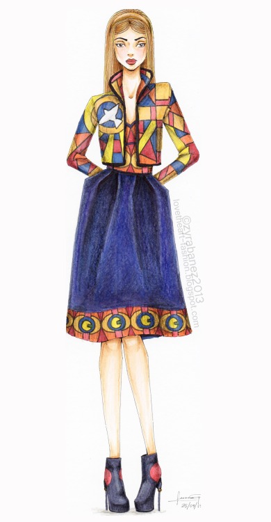
Stained Glass Collection - Design 3

Stained Glass Collection

Media: Copic Markers, Faber-Castell pencils, Pilot G-TEC black fineliner and Quill white A4 Multiboard
Time: 2 hours

This is by far the longest time I have ever taken to draw a complete fashion illustration. I guess it's been a while and I lacked practice.
The collection hasn't been completely abandoned, although finishing it is taking longer than expected. It was in early May this year when I started, and I swore I'd finish it in like a month.
I'm determined to finish this collection since there were a few ones that I abandoned, for example, the Queen Couture Collection. I still like to tell myself from time to time that I just took a break from it - a long break - and I'm going to finish it in the future. However, it's an undeniable fact that there's no way I'm really going to complete that collection. The idea was great at that moment, and I still think it has potential, but none of the dresses I designed fit what I had initially imagined the collection to look like. (That's a whole different story though) For this one, I'm working my way through to completing it, and it might be taking more time than necessary, but as long as I finish it.

Colouring with Copics


Colouring with Copic Markers

Copic markers are one of the most well known and recommended brand for graphic markers by artists. However, it does cost a fair bit of money, as well as the other brands of graphic alcohol-based markers. If you're not of the rich side, it's most likely that you buy one marker after the other, and that's a hard thing to do - choosing which colours to buy first.
How I would've approached this situation is that I'd buy two shades of each colour (red, yellow, blue, skin, grey ect). I'd emphasise getting a dark grey colour such as C-7 since it's useful when it comes to shading. Then I'd buy a black and a colorless blender marker. Overall I'd most likely have 20 Copic Markers. From there, you can build up with by buying more shades of the colours you mostly use.
The image below is a comparison of how I coloured with only 5 Copic Markers and the other one with 9. The image on the left is where I used the grey colour to shade and I only had two shades of brown for the skin colour. The image on the right, I have 5 shades of skin colour and didn't use a grey since I had a dark brown to sue for the shadows.


Hair

Drawing Hair

There are a few guides to consider when drawing the hair. First off, know the direction of the hair. It naturally falls downwards, however, it's possible to create artistic hairstyles which a lot of fashion designers definitely incorporate to their runway collections. Always take note of gravity and other forces that act on the hair. For example, it might be pinned to one side, or you might choose a simple ponytail hairstyle.
The three main guides are:
Point, which is also called the growth point. It makes it easier to draw strands of hair that start from that point. This is useful for drawing the fringe or when hair is secured by a hair tie.
Parting is self explanatory. Different from what I said before, hair doesn't actually grow on one area or point on the head.
Hairline, which is the transition of the hair to the skin. This area of the head should not be a harsh line but a smooth blend, so it's best to use flicking motions.

Facial Proportions

Facial Proportions for Fashion Illustration

Fashion illustration captures the ideal facial proportions of women as well as men. Some may argue that there's absolutely no need for the face because the main focus is the garment design. To an extent I agree that you want the focus to be on the clothing itself, however if I was to emphasise the face, I would've drawn a portrait instead of a full body. Fashion illustration, in my opinion, depicts the entire body: the movement, expression, attitude and clothing. 
So if you want, take the time to know the ideal facial structure. The eyes are located halfway from the top of the head to the chin. A quarter down from the eyeline is where the nose is usually placed. An eighth down from the noseline is where the mouth is. Note that the distance between each eye is the length of an eye.
Ideal beauty is all about the right facial proportions.

Creases and Folds on Clothing

Creases and Folds on Clothing

Creating a representation of garments can be quite difficult as it is easily overdone and sometimes underdone. To get you started with drawing creases on clothes, the basic lines are:
Curves, which are used almost everywhere. A simple flick of the pen provides a natural look to the illustration.
Straight, which represents the effect of gravity and other forces (extension) on the garment.
V or Hooks, which are commonly used for the joint areas in the body, such as the elbows, knees, under the arms, waist and even under the bust area.
TIP: Observational drawing is always a great learning tool. Practice drawing from real life. And don't be scared to combine these basic lines together. Experiment a little or maybe a lot. This allows 

Flower Crown

Self Portrait 1940

Flower Crown

Media: Copic Ciao Markers, Touch Twin Markers, Faber-Castell pencils,
Pilot G-TEC 0.3mm black fineliner and Quill white A4 Multiboard
Time: 1 hour and 50 minutes


I love the look of flower crowns, not so much wearing it on a casual days. There's something elegant yet a little playful with having flowers in your hair. So I decided to create a fashion portrait that celebrates the beauty of flower crowns on women. An inspiration for this was Frida Kahlo, an artist I completely adore. Her life wasn't quite a fairytale and her works conveyed that properly which is always entrancing to look at, and at times I have to admit, quite disturbing. Nonetheless, I love the symbolism she used to capture a meaning and a story in her paintings that only she can truly understand.

Fashion Template

Fashion Template

I have to be honest: I use a fashion template for my fashion illustrations. It's been a recent thing for me since for the longest time, I've been using my old illustrations as a guide for the height of my new illustrations. I don't know about you, but having to rule 10 lines down a page gets a little bit too tedious. So I drew myself a template which I put under the paper that I make my sketches on. From this, I can create different standing poses while maintaining the proportions of the body. 
I am currently teaching myself how to sew my own designs, and the torso has a few lines that help me add details to my design that will also help me when I construct garments.
In case some of you guys might need a little help, feel free to print this out and use it as a guide for some of your fashion illustrations. Please don't claim this as your own. And please respect my rights to this template. I'd appreciate that. Thanks.


Male

Male
Media: Copic Ciao Markers, Faber-Castell pencils, Pilot G-TEC 0.3mm black fineliner and Quill white A4 Multiboard
Time: 1 hour and 30 minutes

It's a rare thing for me to draw a male fashion illustration since first of all, I've been criticized that my male models look way too feminine and second, I have little to no clue about the male fashion world. I only know one or two current trends for men, and because of that, I had a hard time designing the outfit, concerned that it might end up looking like clothes more suited for women than for men.
I admit, I need a lot of practice with male faces, with the body and with the clothes they wear. Obviously there is a distinct feature in garments that are for men and not for women, and vise-versa. I am yet to do some studying and further research to enhance my knowledge and skills.
Meanwhile, I decided to give it a practice since I've been asked quite a few times to create a tutorial on the male figure. I would like to, but I still have a lot to learn on that area, and unless I am confident on drawing men, I won't be making that tutorial yet.

Formal Dress

Formal Dress

Media: Faber-Castell pencils, Pilot G-TEC 0.3mm black fineliner and Quill white A4 Multiboard
Time: 1 hour and 30 minutes

My friend asked me to make her formal dress since I've made my own (which I will post on here soon enough). This is the illustration of the dress that we agreed on, yet we made a few changes.
This is a style of fashion illustration that I'd normally never explore since it requires more time and effort put into drawing two figures and colouring two fashion illustrations. I've done this before, but swore never to do it again, yet here I am with this illustration.
As expected, I'm not completely satisfied with the outcome. I got tired towards the end which ruined the colour of the second dress (left). So, with that said, I will never return to this style, but if I do, it would only be for a great reason.

Jumpsuit

Jumpsuit

Media: Faber-Castell pencils, Pilot G-TEC 0.3mm black fineliner and Quill white A4 Multiboard
Time: 1 hour and 20 minutes

The materials you use do not necessarily determine your skills. An artist who has been practicing for many years can use a cheap medium and still create a beautiful painting/drawing. They utilise the materials they have.
I wasn't born with a million dollars in my pocket. I'm not rich nor am I spoilt. I was, however, fortunate enough to earn money through a commission which I used to by my Copic markers. Aside from that expensive brand of graphic markers, I like to buy cheap art materials that can be found in the dollar store. My local dollar store has a wide variety of mart materials from colouring pencils, charcoal to acrylic and oil paints. Since I still consider myself a beginner, I don't like to buy expensive mediums if I know I'm only going to experiment with it, unlike Copic markers which I know I'm going to use all the time.
With that said, I did this simple illustration using Faber-Castell 48 Classic Colour set which I bought from a school and office supply store. It cost me about $18 which is considerably inexpensive compared to other brands such as Prismacolor and even Faber-Castell Polychromos.

Stained Glass Collection - Design 2

Stained Glass Collection


Media: Copic Markers, Faber-Castell pencils, Pilot G-TEC black fineliner and Quill white A4 Multiboard
Time: 1 hour and 40 minutes

I am only on the second design of the collection and so far, it's been going great. It saddens me, however, that it's taking me what seems to be like forever to complete a single illustration. With the end of the first semester coming up, things need to be handed in and assessed. That means, exams.
I usually don't like to talk about exams and school on any of my social media accounts since it's such a cliché excuse when I haven't been able to update anything. I've used it so many times, even I don't want to hear about it any more, but things have been very hectic and stressful lately that I figured a short rant might just be able to calm me down.
I could wish for more time, however, I honestly just can't wait to finish the year.  In fact, I want time to go faster than the speed of light. The end of the year would mean the end of my high school life and a chance to start anew - to start fresh. Who knows what I'm going to be in the future, but I just know I won't ever be the same person I am today.

Stained Glass Collection - Design 1

Stained Glass Collection

Media: Copic Markers, Faber-Castell pencils, Pilot G-TEC black fineliner and Quill white A4 Multiboard
Time: 1 hour and 20 minutes

I am currently working on a mini collection that I hopefully would expand into a bigger collection, but that depends on my progress. To be honest, I feel like a hipster saying that I used church windows and stained glass in a few of my old designs. I'm not saying that I invented this trend because I didn't. I guess people tend to find inspiration in the same places.
For this collection, I plan to use mosaic as the main print or pattern for the dresses. It's a different take on the Baroque trend since I feel like I've used the gold detailing on red or blue or black fabric too much that I don't feel so inspired by it, instead, I start to hate the trend. So I decided to take a different route with the Baroque prints. On the more high end side of fashion, this trend is very elegant that plays with simplistic patterns, however, in retail stores at my local mall that targets teenager girls, this trend contains very busy prints. I combined both of those characteristics in this design. Church windows as the print adds pops of colour to the dress but at the same time keeping it simplistic and minimal.
I'm not quite sold with the shoe design. I tried to steer away from my usual black platform heels, so I used a burgundy colour that works the colour blocking trend with bright yellow laces.

Have a nice day :)